top of page

TeamUp Integrations Platform Redesign
OVERVIEW:
• TeamUp began a redesign of its entire B2B & B2C application with the vision of becoming the next biggest fitness/gym management platform, alongside Wodify and MindBody.
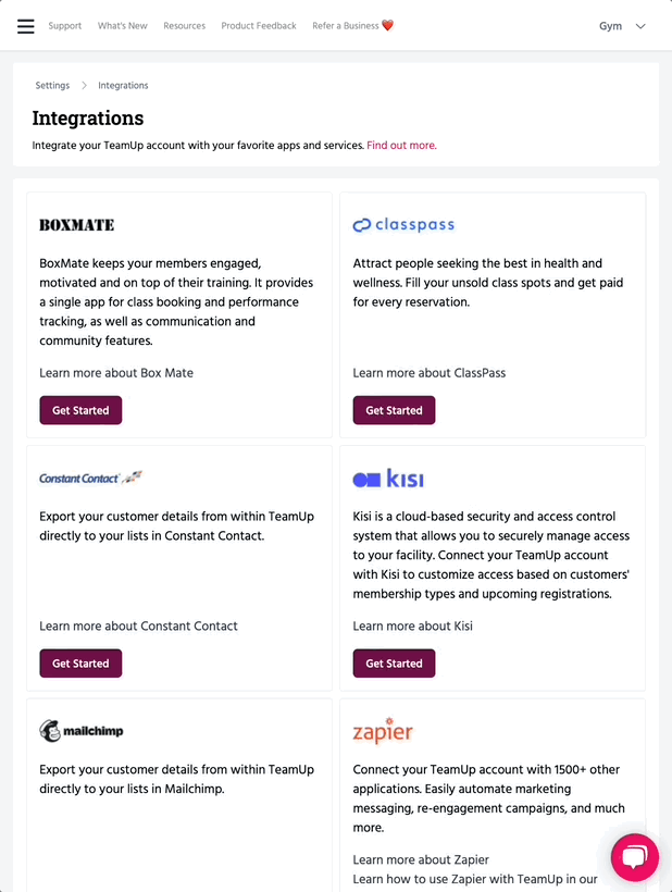
• Our main objective to this particular project is to add a new partnership application, Kisi Control Access Tool, to our Integration setting page.
• In addition to the new feature, I saw an opportunity to redesign the main integration setting page to a more lively layout. As a result, the users will have a better user flow/experience while scrolling through the integration.
ROLE:
• UX Designer
• UI Designer
• Figma
• Notion
• Slack
• Adobe Photoshop
TIMELINE:
May - June 2022
BACKGROUND:
TeamUp is a management software for in-person and online classes at fitness studios, boxes, and gym, worldwide. Learn more about what TeamUp does.
I was the lead designer for this project.
I joined TeamUp as a UXUI Designer in March 2022 as one of 2 designers in a company of 6 engineers and 2 product managers. I support design across every aspect of our business and am responsible for leading UX and UI across key parts of the application side of the platform. In addition, I would assist Marketing whenever they need help designing a specific marketing asset, or creating contents for the company’s website.
I've grown tremendously in the last few months, some key achievements of which I have listed below:
Implemented a design process
Improved usability across the platform
Establishing a design kit
Establishing a design system
This has helped our team establish more structure to how we conduct our work and allow other teams to gain visibility across our upcoming sprints.
No usability tests were conducted by the external consultancy before dev handoff. Since we established a design team, we have been actively working towards conducting UX research and usability testing on all projects.
This has helped to maintain consistency in the look and feel across different parts of the platform.
This has helped the Engineering and Product teams to understand how and why we choose to implement certain components over others.
THE PROCESS:
For this project, my process at TeamUp is based on the Double Diamond Theory and Lean UX process. We aim to incorporate the key phases of Discovery, Definition, Ideation and Implementation in all of our projects.
.png)
1. Research / Fully understand the objective / Ask questions and raise concerns with the product managers.
2. Ideation:
• Paper wireframes
• Low fidelity mockups in Figma
• Final design in Figma
3. Product Manager / Developer reviews
4.User testing
UNDERSTANDING THE PROBLEM:
I conducted research interviews with our primary users (account managers) to uncover any pain points that they were experiencing with the beta release.
I took advantage of our Product Board platform to fully understand our providers feedback and analying their reviews/comments.
Current Page:

Key Takeaways:
Product board feedback from users: Looking for a particular app requires long scrolling.
Opportunity: Turn page into a grid - either 2 or 3 columns. As a result, users will have less scrolling.
Opportunity: Add a message banner or toast popups to state confirmation and success of an action.
Opportunity: Add informative message banners, and tip tool icons to help users understand the task.
WIRE-FRAMING NEW KISI APP + ADDING NEW DESIGNS:


Next Step :
Super important to check in with my Engineers in the early design stage to remove any blockers.
An example of what was discussed:

Desktop: Tip tool should be a layover effect.
Mobile + Tablet: Users will have to tap the tip tool icon to see the message
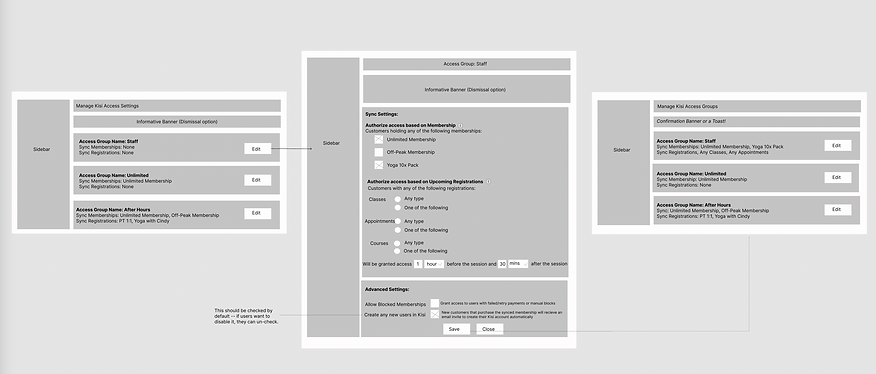
HIGH FIDELITY MOCKUPS:


TESTING / KEY TAKEWAY:
Problem: While testing, users commented the Kisi Settings page was too text heavy, and the sub text looks almost the same as the heading title.
Solution: This got me thinking to either update the font styling, or think of a new UI style. As a result, I kept the header styling the same, but updated the sub categories to a badge component.


FINAL DESIGN:


Final thoughts and takeaways:
User testing doesn't end after development: The team is starting to add internal/external usability testing to our design process (before and after). Design is a constant iteration of improving the experience for the end user. We should always find ways to collect and listen to our user's feedback.
Involve engineering upfront: This helps to reduce any rework later on as an understanding of the technical limitations upfront will help to inform your design strategy.
Other case studies


Government Agency
Montana State Parks
A social app for food lover
Yum Yum
Non-Profit Organization
Keep Kids Fire Foundation
bottom of page