top of page
Point of Sale: Split Checks
OVERVIEW:
Revi POS partners can now split checks by menu items and payment types.
WHY WAS THIS BUILT?
This was a major pain point experienced by our partners who receive split requests from their customers. Cashiers would have to do multiple separate transactions.
WHO WAS THIS FOR?
Quick Service and Full Service restaurants on Revi POS with customers who needs to split their final bill while dining in or ordering take out
WHAT PROBLEM DOES IT SOLVE?
This feature helps our partners with being able to split checks on POS by items or payment types. Previously, partners did not have this functionality available.
TIMELINE:
4 Weeks
LAUNCH DATE:
December 13th 2023
OUTCOME:
• Gained over $25,000 monthly revenue
• Signed up 5 new partners
• Added 30+ existing partner locations
BACKGROUND:
At its core, Revi is a POS system focused on digitalizing customer profiles in hopes to better serve communities and optimize restaurant operations. Through their self-ordering kiosks, the Company captures orders and identifies customer preferences to accurately suggest potential add-ons for future orders at restaurants across their network. The Company maximizes the value of this network through their app—where consumers can engage with their favorite businesses or get rewarded for trying new ones. Learn more about what Revi does
I was the lead designer and researcher for this project.
I joined Revi as a Product Designer in May 2023 as one of 3 designers in a company of 15 engineers and 2 product managers. I support design across every aspect of our business and am responsible for leading research, UX and UI across key parts of the application side of the platform. This was one of the first projects I was given and it has taught me tremendously insights on the POS quick service food restaurant industry.
THE PROCESS:
For this project, my process at Revi is based on the Double Diamond Theory and Lean UX process. I aim to incorporate the key phases of Discovery, Definition, Ideation and Implementation in all of my projects.
.png)
1. Research: fully understand the objective + problem. Ask questions and raise concerns with the product managers and stalkholders.
2. Ideation:
• User flows
• User persona
• Paper wireframes
• Low fidelity mockups
in Figma
• Final design in Figma
3. Product Manager / Developer
reviews
4. Internal and External user testing
UNDERSTANDING THE PROBLEM: Researching + Storyboarding + Competitor analysis


I went onsite to restaurants who are able to accept multiple payments and observe what was that process like and asked for both a digital + physical receipt. In addition, I conducted research interviews with our primary users (cashiers + bar managers) to uncover any pain points that they were experiencing with the beta release.
A key discovery: customers like to split the bill more often in bigger groups, and they are being asked frequency. For instance, people who are on dates, or team lunches. Most important, I discovered on top of asking for splitting the bill request, customers would ask to split into different tabs...


*Screenshots/video of a restaurant manager showing me how Square does split checks + items.
User flows:

Key Takeaways:
Customers in larger groups frequently request to split the bill, and cashiers are asked to accommodate these requests multiple times a day
Some common scenarios: people who are on first time dates, team member lunches, and big family lunch/dinners.
I discovered on top of asking to split the bill request, customers would ask to split into different tabs...
In summary, our feature will need to have both the available to split into multiple payments and multiple tabs.
WIREFRAMES/LOW-FID:

Next Step :
Super important to check in with my Engineers in the early design stage to remove any blockers.
An example of what was discussed:

I wanted to see if we're able to have our own custom keyboard instead of using the native IOS keyboard. However, the developers advised it would be too complex and will need to get approved by Apple. As a result, we had to archived this design until another phrase.
A/B USER TESTING:


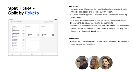
TESTING / KEY TAKEAWAY:
"A bit of learning curve, but is very common in the industry. Cashiers will learn the steps, and then it will all be muscle memories from there.
I wanted to see if adding three options: split by tickets, split by items, and split by payments are all correct and needed in the industry. The users were confused with "split by tickets" verbiage and overwhelmed with so many options. As a result, I will remove "split by tickets" and I learned I didn't need to build something that can do everything in the initial phrase.


HIGH FIDELITY MOCKUPS:

PARTNER TESTING:
I brought out my prototype to visit an onsite partner and showed them my design and to get feedback.
Overall feedback was great. The partner validated this is exactly what they needed. The icons and graphics helped them understood the new feature exactly.
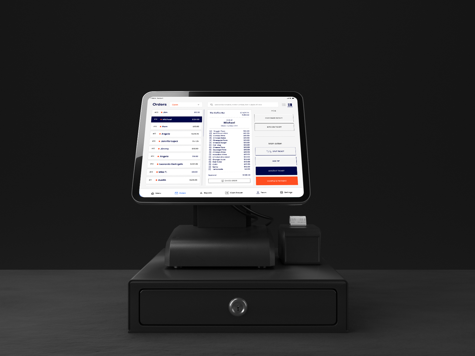
FINAL DESIGN:
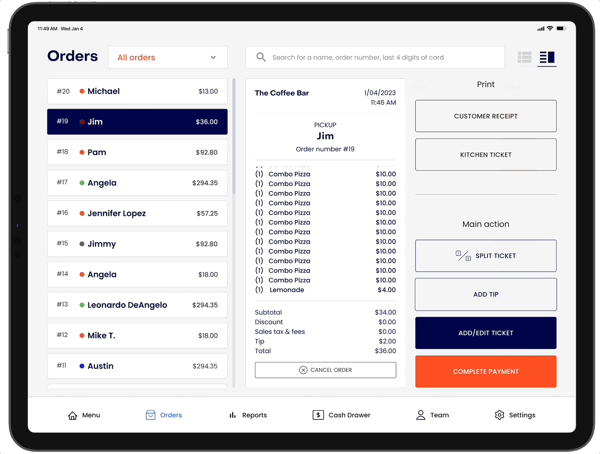
Final thoughts and takeaways:
Beta testing: We released as a beta and selected certain partners to use this new feature. The plan was to get feedback within the next 6 months and see what improvements we can do for the next release.
Involve engineering upfront: This helps to reduce any rework later on as an understanding of the technical limitations upfront.
Outcomes: Gained over $25,000 monthly revenue. Signed up 5 new partners. Added 30+ existing partner locations due to this new release/feature ad
Other case studies


Government Agency
Montana State Parks
A social app for food lover
Yum Yum
Non-Profit Organization
Keep Kids Fire Foundation
bottom of page