Keep Kids Fire Safe Foundation
PROBLEM:
How can we redesign a nonprofit organization to give a strong message surrounding fire safety?
SOLUTION:
Make a kid's corner page to attract children, and provide the resources parents and teachers need to integrate a fire safety program
ROLE:
UX Researcher
UI Designer
Project Manager
TOOLS:
Miro
Figma
Trello
Google Suite
ZOOM
Adobe Illustrator
01. Research:
With the help of 3 other designers, a website brand audit was conducted to discover the strengths and weaknesses of the current layout.
Current website : https://www.keepkidsfiresafe.org


Key takeaways
The contact page is broken. No contact option can be found through the entire website
Each page is short, but messy.
In order to make a donation, users would need open a new page donate with PayPal
02. Stakeholder and User Interviews:


User interviews transcript
Full stakeholder interview transcript
Key takeaways
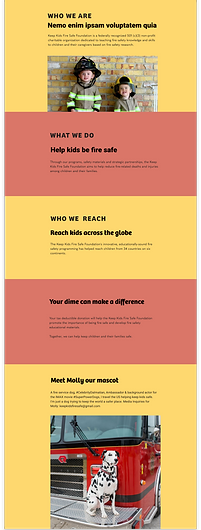
KKFSF wants a strong community engagement, and a fun platform for children from K-12 to find out the importance of fire safety.
They want more children to visit their website, but even better if they have a parent by their side.
They have a Dalmatian, Molly, as their mascot to attract multiple age groups.
Affinity Diagram


Persona

03. Ideate
What I Like, What I Wish, What If Diagram

Feature Prioritization Matrix

Storyboard

Style Tile

04. Wireframing:

About

Home

Donate
Iterations of Home Page


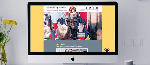
05. Final Product
Try desktop prototype

Try mobile prototype

Create a Kid's Corner page to attract children. They can play games and be educated about fire safety. However, the main users we are trying to target are educators, young adults with children and caretakers.
Use a subtle red because red can signals fire and alarm, which we did not want. However, we felt we had to implement a bit of red to our layouts because this is a non profit regarding fire protection
Remove the donate tab from the navigation bar, and add a donate paw icon as a fix position when scrolling.
Other case studies


An app for job hunting
Joblify
Government Agency
Montana State Parks
A social app for food lovers